
As of completing my booklet for Task 2, I have come to really enjoy the result despite the limitations we were given in terms of the scope. In this task, I tried to focus on using these limitations to my advantage by creating a fluid tale using typography, monograms and a restricted colour palette. What I did not want for this task was to just have my elements placed absent-mindedly amongst the booklet but rather, somehow, tie it all into a neat little story that would give purpose to the necessary aspects and give the hypothetical reader a reason to take in every element. While the placement of the text brought inspiration, I focused mainly on the creating environments for the elements to live, which became more literal later as I started to play with the pen tool on In Design.
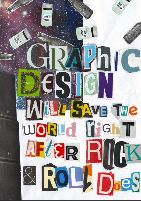
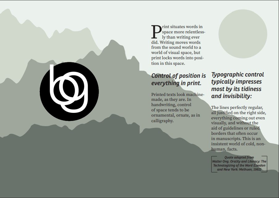
The most challenging part of this assignment was trying to create a theme out of seemingly nothing; While I did enjoy the Ransom note I made for the front cover, I felt the vibe was extremely similar to the first task we did and preferred to do something a little different for the inners of my booklet to present a better array of my capabilities. Perhaps in retrospect it would have been better to have planned the inner flow before constructing my Ransom quote but I just couldn’t go past a David Carson quote after spending so much time earlier in the semester researching the ways in which he creates. While the cover does not match the inner monologue, I feel that I attempted to channel some of the things I learnt from Carson’s practice to construct the woven tale for my elements. I believe this is most notable on pages 3-4 where the text somewhat takes the shape of the mountains in the background, while not as eclectic as Carson, I took extra caution making sure that the type had some form of expression.
Another challenging aspect of this assignment which in the end led to some great lessons was the dreaded pen tool. As mentioned earlier, the scenery I created throughout my booklet was mostly created with the pen tool, a tool I had been way too intimidated by prior to ever challenge and perfect, despite having a collective decade worth of experience across the Adobe programs. I cannot say that I’ve now become the pen tool master, but I can’t say that I didn’t try; I feel the end result presents the style I was going for and I suppose there is not much more I can ask for. I am hoping in the future to further experiment with the tool in order to get a better hang of it as I know understand the possibilities it possesses when it comes to graphic design. It is certainly a love-hate relationship for now.
While in the first task I stuck to what I knew, I really tried to step outside of my comfort zone to achieve something I never thought I would (or could) come up with. I have always had trouble with incorporating a colour scheme to my works and, while this may only be the first step to getting better, I feel the result is a step up from my first task where I did not achieve the best incorporation of colour. With the imperfections of the first task came growth and development and I feel very proud of what I have managed to produce.
