Andy Warhol
We are all aware of the influence Andy Warhol has had not only on the progression of modern art but as well as the cultural implications he laid throughout his pieces. Warhol was best known for his exploration of pop culture and artistic expression, as well as exploring the world of mass production and consumerism. As a commercial artist, Warhol had a fascination for advertisement, which undoubtedly led to one of his most recognisable works, Campbell’s Soup Cans.
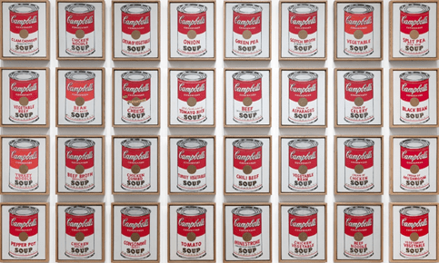
This piece consisted of thirty-two canvases, with each representing all the different flavours Campbell’s offered at the time. The otherwise identical portrayals were completed through a combination of projection, tracing, painting and stamping. To create such a stupendous array of the same image, multiple times, meets the hypocrisy of the statement being made. This somewhat satirical imitation of a production line mirrored the developments of American society at the time, mocking the very line of work Warhol himself was involved with as a commercial artist who produced marketing materials. However, the uniformity of the product’s packaging was met with the invention and originality of painting, creating a crisis of whether these images are nothing more than an imitation of mass production or rather each holds originality due to the process having to differ each time due to its process of creation. The collection would later be reimagined with screen-prints to further achieve the mechanised look and placing this thought in further doubt and leaving less room for slight inconsistencies.
By condensing his subjects to their most basic element, whether it be a Coca-Cola bottle, a Brillo box or Marilyn Monroe herself, Warhol presents the viewer with the cultural icons of the time, front and centre, if not like a mirror reflecting on the viewers own worldly views. Warhol offers the viewer a chance to question the world around them and reflect upon the ever-changing advancements of not only pop culture, but even the way in which society operates to meet the new needs of consumerism.
David Carson
Experiment design that burst outside the editorial box previously viewed as a staple to the wonderous world of graphic design, David Carson pushed boundaries beyond the modernist ideal into the postmodern. Despite having no professional training with graphic design, only hearing of the term for the first time at the age of 26, Carson was able to focus his energy on creating designs that reflect expression and interpretation rather than sticking with the fundamental criteria. Carson’s works are the definition of ‘thinking outside the box’, both figuratively and literally. Extreme forced justification, no gutters for columns, erratic spacing, and reverse reading are just a short list of unconventional techniques specialised by Carson to challenge the ‘necessity’ of legibility, in which led to his title as one of the most influential graphic designers ever, orchestrating the look and attitude of the 90’s surf and skate scene.

The purpose of this rebellious attitude towards the modernist typographic criteria is to use all elements as being part of the greater picture. To use typography as part of the expression of the overall work was something quite unique to Carson during the 1990’s, adding extra flare to his work by encompassing all components required in the scope to construct his own interpretation of the message to then be viewed by the masses. His claim to fame came from the sub-culture of surfing and skating where his creativity appealed to the demographic. Having an early professional surfing career himself, Carson allowed his own identity and experience to shine through, allowing for a relation with the target audience and granted him a more experimental mindset. The impact David Carson has had on graphic design by collapsing expectations and embodying the interests of the viewers is spectacular, somewhat mixing the necessity of graphic design with the freedom of traditional art. While you would expect that with a lack of knowledge on the precedent for good graphic design regarding visual hierarchy typographic syntax but rather, in Carson’s case, accelerated him into celebrity status amongst the profession.
Reflection – Task 1 Part 2
I have been able to collect a lot more letterforms out in the wild within the past few weeks, however I am still stumped on a handful that are much harder to find than I expected. Thankful, however, I do have the all the letters currently for the phrase ‘Letter Form Lane’ so that is the title I am leaning towards for my poster. I feel that having three words rather than two would also be advantageous for me in terms of designing my poster as I feel it has more of a balance as well as providing more elements to play around with. Since we became aware of this task, I really wanted to attempt to make something in a style that I was familiar with, meaning I had always been leaning towards postmodernism as my period inspiration for my poster and that interest has grown drastically since doing research on famous designers. I am heavily inspired by the chaotic practices of David Carson and the rebellious themes of Barbara Kruger and hope to use attributes from both artists to create a grunge inspired piece for my poster. I love the use of a monochromatic colour scheme with a pop of red within Kruger’s works and feel I would like to give a nod to this as she is one of my favourite artists, not to mention the coincidental salute to the grunge aesthetic. I am interested to play around with the letterforms to also include a reference to Carson’s experimental use of typography as expression.
