Pop Art – Tadanori Yokoo ‘having reached a climax at the age of 29, I was dead.” 1965
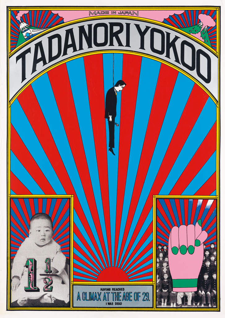
Tadanori Yokoo presents a unique addition to the Pop Art movement with his piece ‘having reached a climax at the age of 29, I was dead’ 1965, taking the image of traditional Japan to a new vibrancy that layers with darker meaning. With clean overlapping and repetition of colour and ‘rising sun’ pattern, in which has been contrasted with red and blue making the image equally hard to consume while demanding the viewer to peel away the invasive bombardment to decipher the tale beyond, you find a twisted tale of life that leads to an end prematurely represented by an almost classic circus-like poster style. The way in which Yokoo balances the image to include a woven tale of existence from beginning to end within a finite amount of imagery to enforce the limitations of life as well as a reflection upon the expectations of Japanese society.
“By utilizing visual metaphors, metonyms, allegory, collage, and chance processes – and slamming it all together – Yokoo created design that, looking backward, disrupted the continuum of graphic design history as we know it. Yokoo was postmodern before such a term existed.” (Lynam, 2015)
While the motives of this piece may stand as common place in a modern art scene, it was taboo in a 1960’s Japan where the piece was intended to be a contribution to a group exhibition within a department store, especially when you begin to break down the symbolism constructing a shocking amount of political commentary and self-expression. The piece with a combination of traditional Japanese imagery with the inclusion of personal photographs of childhood, one being covered by a hand with the thumb wrapped up by the index finger in which in Japanese culture is the equivalent of giving someone the middle finger in Western culture, concludes on the note of a youthful figure hanging by a noose bringing the short autobiography to an end. This layering of imagery upon metaphor after metaphor dazzles the consumer with societal expectation within Japan at the time, the forceful need for success before the age of 30 or you are deemed to be of no use.
Postmodernism – Barbara Kruger ‘Untitled (Your Body is a Battleground)’ 1989
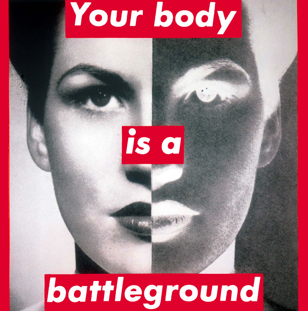
Barbara Kruger happens to be one of my all-time favourite artists, fighting sexism through graphic design in a way that may be simplistic at first glance, with deeper threats laying beyond through design principles. With a combination of photographic manipulation, splitting the image of the woman into harshly divided positive and negative exposures, and the addition of bold Futura font with red panelling provides the piece, ‘Untitled (Your Body is a Battleground)’ 1989, with a sense of public art or one of commercial use. Kruger believes with this organisation of layout she can somewhat streamline a moral for a majority to digest rather than just those that are creatively inclined:
“I think that there is an accessibility to pictures and words that we have learned to read very fluently through advertising and through the technological development of photography and film and video… It’s about dissolving meaning. To reach out and touch a very relaxed, numbed-out, vegged-out viewer.” (Kruger 1991, p 447)
For the illustrated matter she produces, this seems to serve as an elusive sense of comfort prior to the realisation of what the photo is bringing to light. We are consistently being bombarded by advertisements and commercial material that do not necessarily serve as artistic handiwork, but rather just elements used to sell something. Kruger attempts to ‘sell’ the reality of women and the hardships they face for the gender they were born into, remarking on the atrocity of how a women’s right to their body is something they are continuously conscripted to battle for. It takes the topic of abortion away from an authoritarian setting and places it into the hands of the community; demonstrating the stark reality of the situation for the women they are fighting about.
Reflection – Task 1
At the onset of this assignment, I thought it would be simple to find the shapes amoungst nature to create my letterforms however I’ve come to realise that I am absolutely terrible in seeking these shapes out. While I am really confident in the digital elements that we have been starting to work on in class in order to have them formated for our posters and submission, it’s the hunting aspect that has me stumped. While some letters are easy to find amidst the nature and urban shapes of the outside world, others are much harder to come across, making me feel as though I’m falling behind already. I’ve began to transfer the images I have already gathered from the university environment, manipulating them tAt the onset of this assignment, I thought it would be simple to find the shapes amongst nature to create my letterforms however I have come to realise that I am terrible in seeking these shapes out. While I am confident in the digital elements that we have been starting to work on in class in order to have them formatted for our posters and submission, it is the hunting aspect that has me stumped. While some letters are easy to find amidst the nature and urban shapes of the outside world, others are much harder to come across, making me feel as though I am falling behind already. I have begun to transfer the images I have already gathered from the university environment, manipulating them through levels on photoshop and have begun to compile them onto my proof sheet within In-design. I suppose I am thankful that I have much prior experience in both programs, making the process stress free and allowing me to focus more of my time in the gathering of images/letterforms. I’m hoping to take more walks in the local area to gain a better array so fingers-crossed that I can collect most, if not all, before starting the poster section in the coming weeks.
Reference List
Lynam, I 2015, ‘The album design of Yokoo Tadanori’, Redbull Music Academy, weblog post, 8th June, viewed 13th March 2021, <https://daily.redbullmusicacademy.com/2015/06/yokoo-tadanori-album-design>
Mitchell, W & Kruger, B 1991, ‘An interview with Barbara Kruger’, Critical Inquiry, Vol.17, No.2, pp.434-448
